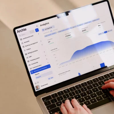
Follow this step-by-step guide to create a coworking space website, with great website examples at the end to inspire you.
Guide to creating a coworking space website
Step 1: Give your brand some thought
Before you start building your coworking space website, take a moment to think about your brand. How do you want people to see your space when they land on your website?
It’s not just about the name. Branding includes your logo, your colors, your fonts, and even the overall vibe or personality of your space. Are you going for a cozy, community-focused feel? Or something more sleek and professional? Your website should reflect that.
A fun and helpful way to explore this is by creating a mood board. Think of it like a collage that brings together images, colors, backgrounds, and website examples that inspire you.
You can make one using free tools like Canva or InVision — just drag and drop pictures, color swatches, and fonts you like until it starts to feel like what you’re actually going after.
Once you’ve got a clear picture of your style, choose:
- 2 or 3 main colors that go well together,
- One or two fonts that are easy to read (like Arial, Helvetica, or Montserrat),
- A simple logo that uses your chosen colors and helps people remember your brand (if you need some help in that department, you can use free logo makers like Logo.com or Design.com).
Don’t worry too much about making it all look perfect! Just try to keep things clean and consistent.
Step 2: Next, think about your budget
Websites come in all shapes, sizes, and price ranges. The good news is, you don’t need to spend a fortune to have a good one.
If you’re just starting out with a small coworking space, a basic website might cost you around $150–$300, especially if you use a DIY platform like Wix or Squarespace. These tools let you build your site yourself (or with a little help from someone on Fiverr or Upwork) without needing to know any code.
If you’re looking for a more custom or advanced website and want to work with a developer or agency, costs can climb into the thousands, sometimes even $5,000 or more, depending on what you want.
The good news is that you can always improve or expand your site later as your coworking space grows. If you choose to build a coworking space website from scratch, though, you have to pick the website platform that fits your needs, skill level, and budget:
Step 3: Choose the coworking space website builder
There are quite a few options out there, so let’s break down the most popular ones in simple terms, along with their pros and cons.
1. Squarespace
Best for: DIYers who want a stylish site with minimal fuss
Squarespace is a popular choice for people who want a website that looks professional but don’t want to mess with coding. It has nicely designed templates, easy drag-and-drop tools, and good support. You can build the whole site yourself, and if you need a little help, it’s easy to find freelancers online.
2. Wix
Best for: Beginners on a budget, especially if you want to build it yourself
Wix is another no-code option that’s known for having lots of templates, website personalization options, and tons of features you can add. It’s very user-friendly and lets you drag elements wherever you want. You can add photo galleries, videos, maps, and more, no coding needed. Plus, it’s super affordable for new businesses.
3. WordPress
Best for: Businesses that want more control over the website and have the budget to hire help
WordPress is the most powerful and flexible website builder out there, but it comes with a learning curve. You can build just about anything with WordPress. There are thousands of plugins and themes you can use. It’s not as beginner-friendly, and it requires more maintenance to keep everything running smoothly.
4. Webflow
Best for: People who want more flexibility and don’t mind learning a bit
Webflow is a hybrid between a no-code builder and a coded website. It gives you more design freedom than Squarespace or Wix, but it’s still easier than WordPress if you want some custom features. It’s a favorite among designers who want creative control but don’t want to build everything from scratch. There’s a bit of a learning curve, so it might take you longer to get the hang of it.
5. Fully custom website
Best for: Large coworking companies or premium brands
If you want something truly unique and have the budget for it, you can always hire a developer or agency to build your coworking website from the ground up. You’ll have full freedom to create whatever you want. Your website can be completely tailored to your brand and needs. But it’s the most expensive route, and you’ll need to find a trustworthy developer. Once the site is done, it can also be harder (and more costly) to make updates or changes unless you keep working with the same person or agency.
Step 4: Now, pick a domain name
Now that you’ve got your website builder sorted, it’s time to choose your domain name — basically the address people will type in to find your coworking space online, like SharedDeskToronto.com.
It’s what people will type into their browser to visit your coworking website. It’s also what shows up in search results and on your business cards, flyers, social media profiles, and more.
How to pick one? Well:
1. For starters, keep it short and easy to spell
Try to avoid long or complicated words. You want people to be able to remember and type it without a second thought. If someone hears it once, they should be able to type it in later with no confusion.
Example:
✅ Good: worknest.com
❌ Not so good: TheUltimateDowntownSharedWorkingHub.com
2. Avoid numbers or special characters
Adding things like numbers, dashes, or symbols can make your domain harder to remember or explain. When in doubt, imagine telling someone your web address out loud.
Example:
✅ Good: BrightSpaceStudio.com
❌ Not so good: Bright-Space-123.com
3. Make it relevant to your business
It helps to include a word related to coworking, like “desk,” “hub,” “workspace,” or even your location. This not only makes your name more recognizable, but it can also help with search engines like Google (we’ll discuss it in more detail below).
Examples:
- OpenDeskBerlin.com
- CollabHubNYC.com
- CoWorkBrighton.com
4. Check if it’s already taken
Before you fall in love with a name, do a quick search to see if it’s already registered by someone else. Most domain providers (like GoDaddy, Google Domains, or Namecheap) will let you search and buy right on their site.
5. Try a domain name generator if you’re stuck
If your favorite names are already taken or you’re just not sure where to start, use a free Domain Name Generator. Just type in a keyword (like “cowork” or your city’s name), and it gives you creative suggestions to choose from.
Step 5: Structure your website
Here’s a breakdown of the coworking space website elements you simply have to include:
1. Homepage
Your homepage is the first thing most people will see, so it should quickly answer two big questions:
- What is your coworking space?
- Who is it for?
Use this space to show off your vibe, share a strong headline (“Flexible office space in the heart of [your city]”), and include a quick intro. Add one or two beautiful photos of your space and include a clear button like “Book a Tour” or “See Our Plans.”
2. Services
Your Services page is where you explain what people can actually rent or book, including different desk options (hot desks, dedicated desks), meeting rooms, private offices, event spaces, or coworking space add-ons (like printing, coffee, bike storage, etc.).
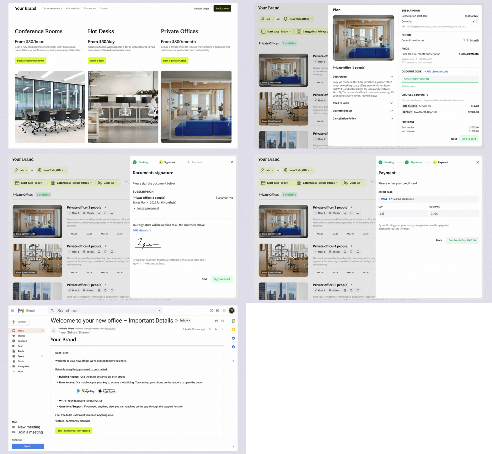
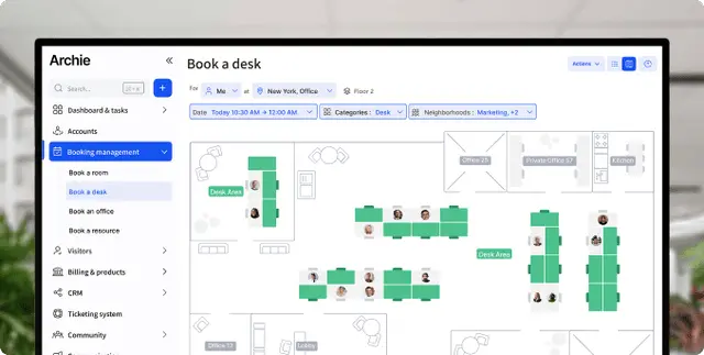
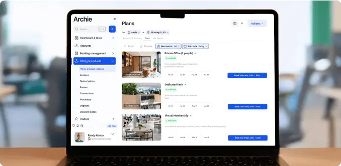
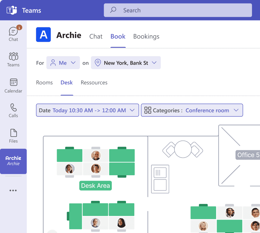
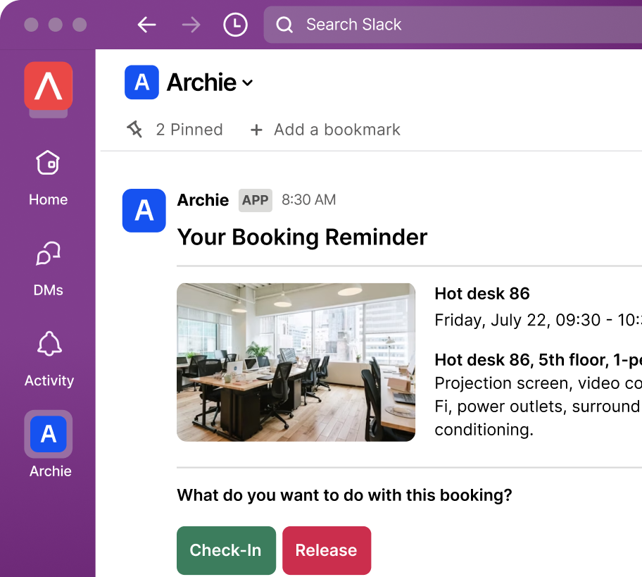
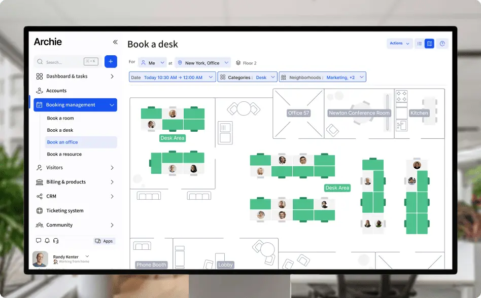
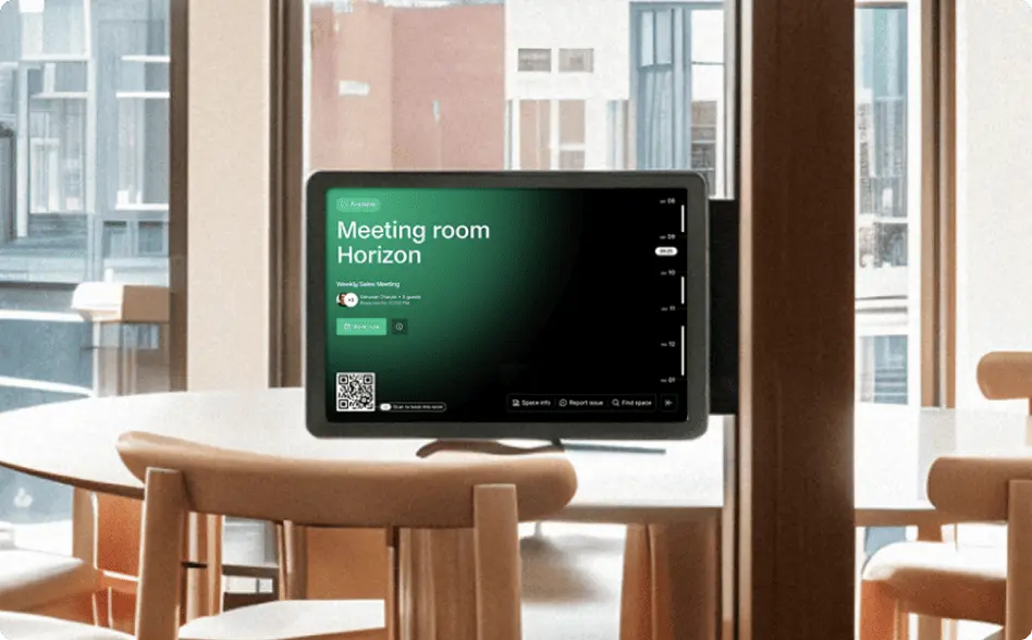
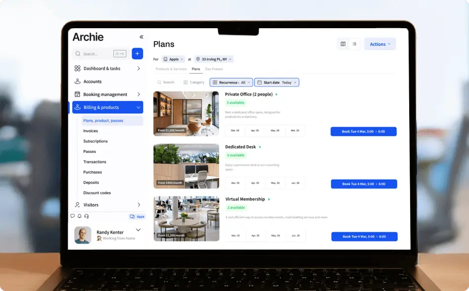
On that note, if you want to turn more website visitors into coworking space members immediately, make it easy for them to book the services you offer. You can use coworking management tools like Archie to handle:
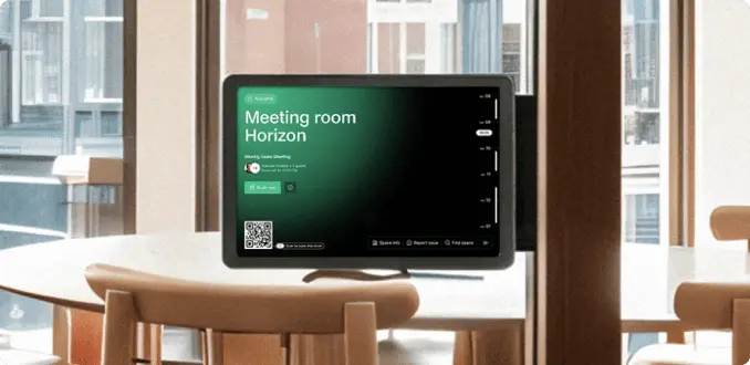
- Online bookings: Let people book desks, rooms, or private offices directly from your website.
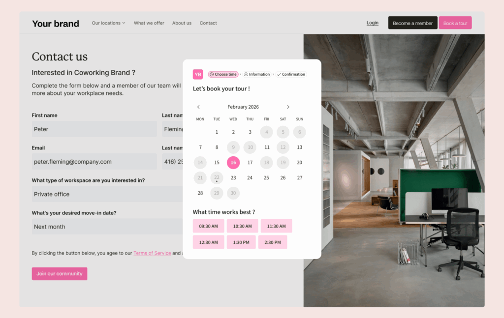
- Tour requests: Add a “Book a Tour” button that connects straight to Archie. You’ll collect contact info and manage leads without lifting a finger.
- Membership sign-ups & payments: New members can join and pay online. Archie handles the details, so you don’t have to.
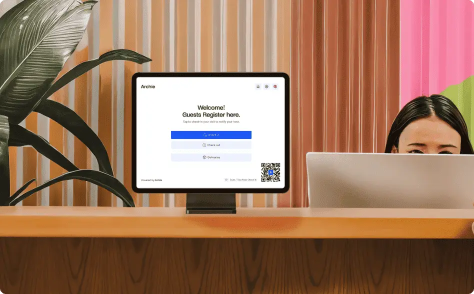
- Visitor check-ins: If your space allows guests or day passes, Archie lets you manage check-ins right from your site, keeping your coworking space secure and organized.
- Event calendar & community board: Link to your events and updates so members always know what’s going on. People can RSVP, join events, or get updates all in one place.
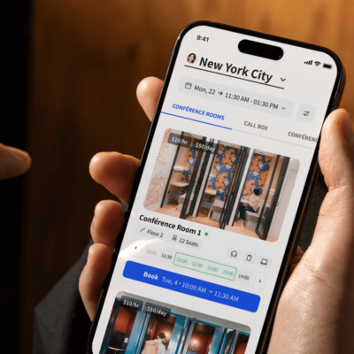
And the best part? Archie’s coworking software can be customized to match your brand, so it feels like part of your coworking space website. You can even choose to build a white-label mobile app if needed.
3. Coworking space contact page
Your Contact page is often the last stop before someone decides to reach out, ask a question, or even book a tour of your space. That’s why it deserves just as much attention as your homepage!
Here’s what you absolutely have to include on your coworking space contact page:
- Contact information (your physical address, phone number, email, and opening hours)
- A simple contact form
- Social media links (add icons that link to your Instagram, Facebook, LinkedIn, or any other platforms you use)
Your contact page is also a great place to add a few personal touches, like photos of your space and team members, reviews or quotes from happy members, Google Map integration so visitors can see exactly where you are and how to get there, and an FAQ section with the most burning questions (Do you offer day passes? Can I book a meeting room without being a member? Is parking or bike storage available?).
No matter how many subpages you choose to create, make sure your menu is clear and well-organized, with no more than 5–7 main items at the top of the page. Here’s a sample menu to give you an idea:
- Home
- About
- Services
- Contact
- Book a Tour
Step 6: Optimize your content
You’ve done the fun part and designed a great-looking website. Good job! Now it’s time to make sure people can actually find it. That’s where website optimization comes in.
SEO stands for Search Engine Optimization. It’s all about making small tweaks to your website so that Google can find it and show it to people searching for coworking spaces like yours. When done right by using an SEO checker, your site shows up higher in search results, and that means more visitors (and potential customers).
Use the right keywords
Keywords are the words or phrases people type into Google. Use phrases like:
- “coworking space in [Your City]”
- “shared office in [Neighborhood]”
- “flexible workspace near me”
Sprinkle these into your homepage, service pages, and titles, but make sure it still sounds natural.
Keep your language simple
Avoid too much industry jargon. A lot of people might not know what “hot desking” or “dedicated desk plans” mean. Instead, use clear words like rent a desk, book a meeting room, or work-friendly space in [City].
Add links to trustworthy websites
If you mention a partner, a local café, or any useful service, link to their website. Google likes that. It shows your site is connected to other real businesses and helps build credibility.
Make sure your site works on mobile
More than half of web traffic comes from phones. If your website looks weird or loads slowly on mobile, people will leave (and Google will notice…). Most website builders (like Wix or Squarespace) let you preview and tweak the mobile version before you go live.
Collect testimonials
Great reviews build trust and help your website rank better in search results. Create a Google Business profile, encourage happy members to leave a review, and proudly display them on your site.
Consider running a blog
If you enjoy writing or want to improve how well your site ranks on Google, a blog is a great idea. It can be a place to share:
- Coworking tips
- Community updates
- Stories about your members
- Local news and events
It also shows that your business is active and up to date, which visitors (and Google!) appreciate.
Set some budget for ads aside
If you want to show up at the top of Google results right away (instead of waiting for SEO to kick in), you can run ads using relevant keywords like:
- “office rental in [Your City]”
- “coworking near [Landmark]”
- “book meeting room [City]”
You can set your budget and only pay when someone clicks on your ad. It’s a great way to attract leads faster, especially if you’re just launching.
And finally... hit that publish button!
Just a few final checks before your new coworking website goes live:
✅ Proofread everything: Check for typos, broken links, and any placeholder text you forgot to update.
✅ Preview it on desktop and mobile: Run a mobile-friendly test to make sure your site looks great on all screen sizes. Test it on your phone, tablet, and computer.
✅ Ask a friend to test it: Sometimes a fresh pair of eyes will catch things you missed. Ask someone to scroll through the site like a potential customer. Was anything confusing or missing?
Coworking space website examples
If you’re building a website for your coworking space, it can really help to see what others are doing well. The coworking space website examples below all have something in common — they’re easy to use, look great, and give visitors a clear picture of what the space is all about. Let’s take a look.
The Bureau
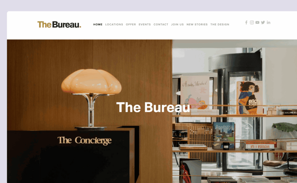
The Bureau is a stylish coworking space in Paris, and their website gives off a very polished, high-end vibe. Everything is super clean and modern, with lots of white space and simple animations. The photos do most of the talking, and it’s really easy to find information about memberships, space amenities, and how to get in touch.
Crew Collective & Café
The coworking space Crew Collective also doubles as a café, and their website shows off both sides beautifully. It has big, eye-catching photos of the space (which is inside a historic bank!), clear menu options, and easy-to-find booking links.

Montreal Cowork
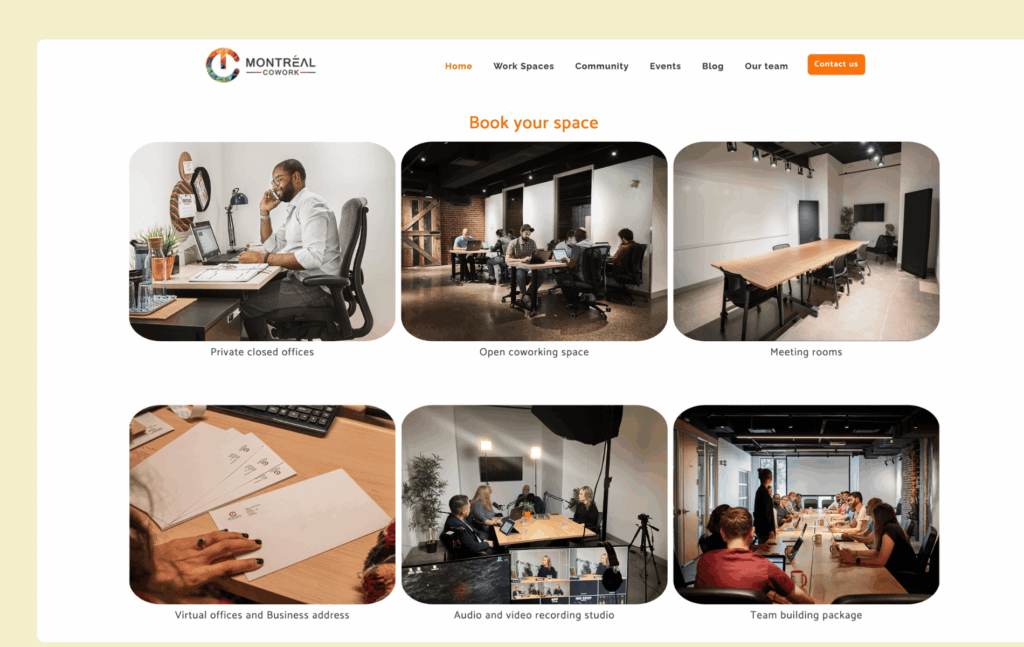
Montreal Cowork’s website keeps things simple, and it works really well. You can quickly see what the space offers (like hot desks, offices, and meeting rooms), and there’s even a pricing section right on the homepage. It’s easy to navigate, mobile-friendly, and perfect for freelancers or small teams who just want to find a spot and get to work.
The Hivery
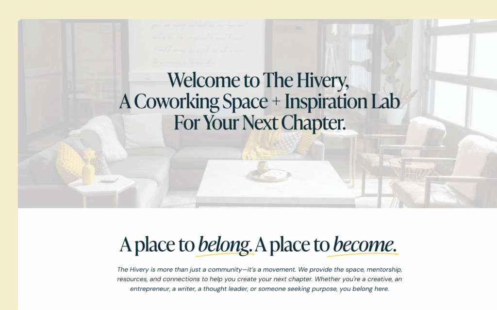
The Hivery’s website was built using Squarespace, and it shows just how nice a simple DIY website can look. It’s soft, friendly, and inspiring, with clear buttons to book a tour, join the community, or check out events.
What these coworking spaces websites do well
- They’re easy to read and navigate
- The photos show off the space really well
- The design matches the vibe of the space (cozy, elegant, fun, etc.)
- They make it easy to take action, like booking a tour or joining online
Your website doesn’t need to be complicated or expensive. Focus on the basics, like clear info about what you offer, great photos of your space, simple navigation, and a way for people to contact you or book a tour (you can easily do that with Archie, btw). You’ve got this!

Berenika Teter
Archie's Content Manager, fueled by filter coffee and a love for remote work. When she’s not writing about coworking spaces and hybrid workplaces, you can probably find her exploring one.





![38 Top Coworking Conferences and Events of 2026 [Confirmed] Top coworking conferences - cover image.](https://archieapp.co/blog/wp-content/uploads/2023/10/coworking-400x400.jpeg)
